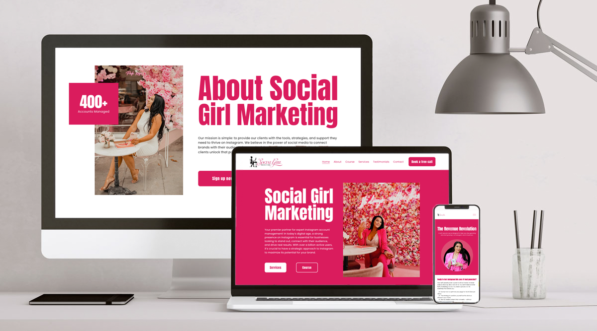
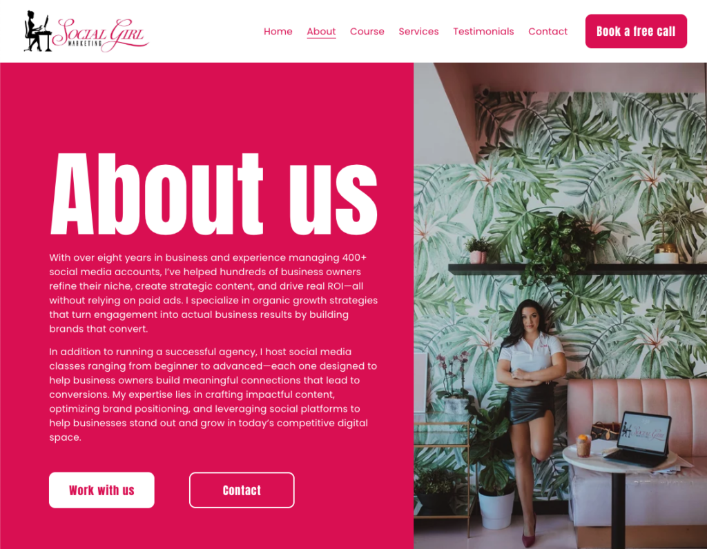
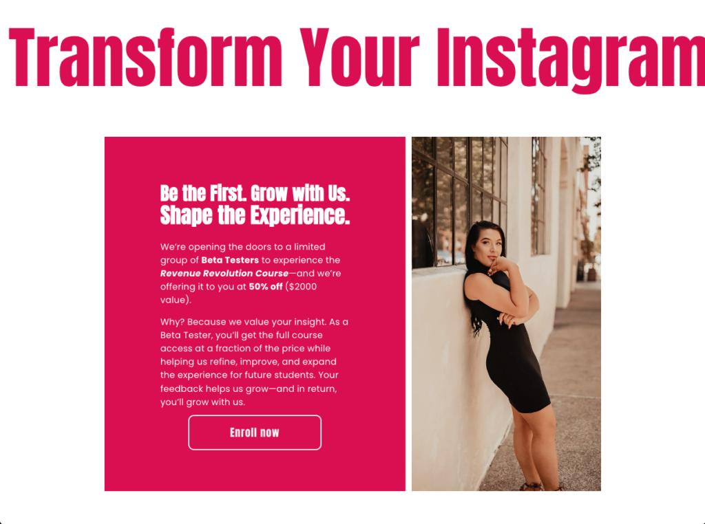
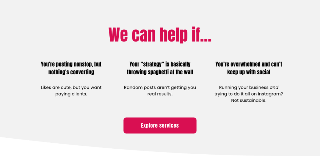
A vibrant web presence for a social media agency ready to look as bold as their work. The goal was a site that conveyed energy, expertise, and range across their full offering: from managed content to hands-on community classes to 1:1 coaching.
Client Social Girl Marketing
Designer Lauren Bosse
Date August 2025
Category Branding, Web Development
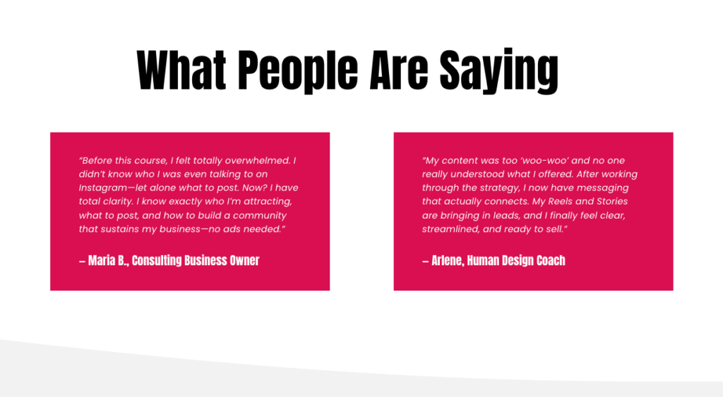
Delivered a high-contrast, display-forward site that gives each service tier its own visual weight, and matches the bold, high energy brand of Social Girl Marketing. Big-scale typography, structured pricing cards, and a clear pathway from browse to book without losing any of the brand’s personality.